Illustrations & Fun Extras
This is where my passion started—drawing, painting, and bringing ideas to life through creativity and color. The Illustrations & Fun Extras page is a peek into the playful, imaginative side of my work. From hand-drawn sketches to digital illustrations and experimental projects, each piece tells its own story. It’s a space where I explore, create freely, and reconnect with the roots of why I fell in love with design in the first place. Take a look around and you might just find a new favorite!
Still Life Project
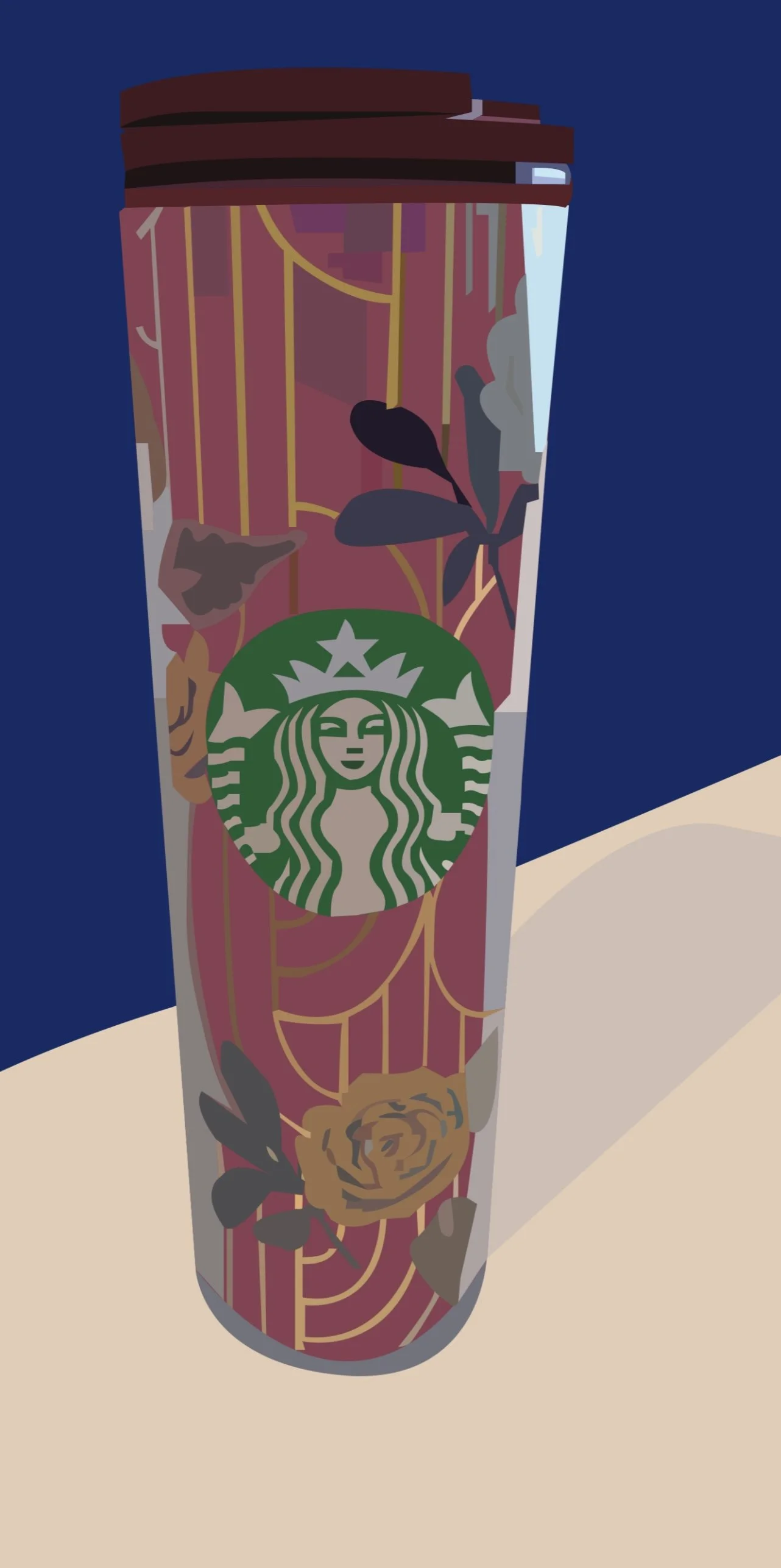
This still life project marked a major turning point in my design journey—it was my very first project using Adobe Illustrator in college, and the moment I realized I wanted to pursue graphic design as a career. The challenge was to create a still life illustration using only the Pen Tool, and I decided to push myself by choosing one of the most complex objects I could find: a Starbucks cup featuring intricate designs and subtle details.
Using only the Pen Tool forced me to develop precision, patience, and an eye for form and composition. It wasn’t just a technical exercise—it became a creative breakthrough. As I carefully traced and built out each curve and detail, I found myself completely immersed in the process. It was both challenging and incredibly rewarding, and by the time I completed the piece, I knew I had found something I truly loved doing.
This project not only taught me the fundamentals of vector design and how to work within constraints, but also sparked a passion that has continued to grow ever since. It was the beginning of my journey into graphic design, and it gave me the confidence to keep learning and refining my skills.
Book Illustration
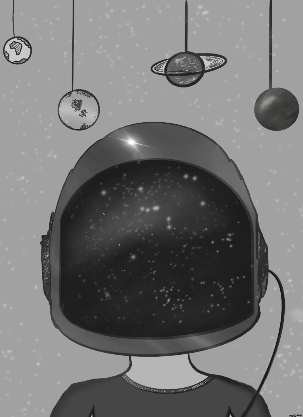
For this book illustration project, I chose to illustrate Wonder by R.J. Palacio, one of my all-time favorite books. It’s a deeply moving story about a boy named Auggie who looks different from his classmates but learns to embrace who he is and not let others define his worth. The themes of self-acceptance, kindness, and inner strength really resonated with me, and I wanted to capture those powerful moments visually.
I selected two impactful scenes from the novel and brought them to life through digital illustrations using Procreate. My goal was to reflect the emotional depth of the story while staying true to its hopeful tone. From sketching the compositions to refining each detail, this project was not only creatively fulfilling but also incredibly meaningful to me. It reminded me why I love storytelling through art and how powerful visual narratives can be in supporting messages of empathy and self-love.
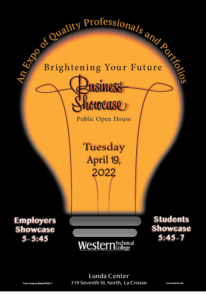
Event Poster
This poster was created as my final project in college, designed to promote the annual Business Showcase event at Western Technical College. The event serves as a major milestone for students, giving them the opportunity to present their work to employers, peers, and the public. I wanted the design to feel bold, professional, and uplifting—something that would visually reflect the significance of the event and the hard work of the students.
I combined Adobe Photoshop, Illustrator, and InDesign to complete the project. The concept of the lightbulb symbolizes bright futures and ideas, perfectly aligning with the event’s tagline, “Brightening Your Future.” I used Illustrator to design the lightbulb and filament shapes, Photoshop for the glow and lighting effects, and InDesign to lay out the final text and structure with precision.
This project was not only a test of my technical skills across multiple Adobe programs, but also a meaningful close to my college experience—a visual celebration of everything my classmates and I had worked toward.
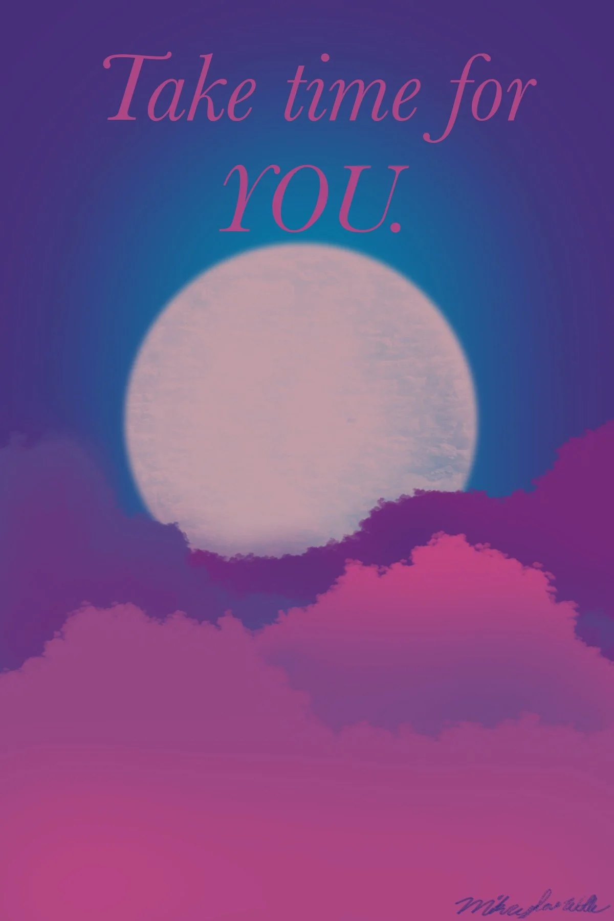
This piece is one of my absolute favorite digital illustrations I’ve created. Designed in Procreate, it combines soft gradients, dreamy clouds, and a glowing full moon to evoke a sense of peace and reflection. The message, “Take time for YOU,” is something deeply personal to me—it's a gentle reminder of the importance of self-care and slowing down in a fast-paced world.
I experimented with color blending and atmospheric depth to give the artwork a calm, ethereal feeling. The transition from deep purples to warm pinks was intentional, meant to symbolize emotional healing and serenity. This piece represents not just a design choice, but a mindset I try to live by. Creating it was incredibly fulfilling, and it stands out as a visual expression of both my style and values as a designer.
Digital Illustration